Sunday, 2 March 2014
Evaluation
Question 1.) In what ways does your media product use, develop or challenge forms and conventions of real media products? (i.e. of music magazines)
<iframe src="http://prezi.com/embed/73akpqmlfmjn/?bgcolor=ffffff&lock_to_path=0&autoplay=0&autohide_ctrls=0&features=undefined&disabled_features=undefined" width="550" height="400" frameBorder="0" webkitAllowFullScreen mozAllowFullscreen allowfullscreen></iframe>
Question 2.) How does your media product represent particular social groups ?
<iframe src="http://www.slideshare.net/slideshow/embed_code/31813938" width="476" height="400" frameborder="0" marginwidth="0" marginheight="0" scrolling="no"></iframe>
Question 3.) What kind of media institution might distribute your media product and why?
<iframe src="http://www.slideshare.net/slideshow/embed_code/31814715" width="476" height="400" frameborder="0" marginwidth="0" marginheight="0" scrolling="no"></iframe>
Question 4.) Who would be the audience for your media product?
http://youtu.be/ClR_Xd0tYzA
100%
Question 5.) How did you attract/address your audience?
<iframe src="http://prezi.com/embed/7euyiisusqd1/?bgcolor=ffffff&lock_to_path=0&autoplay=0&autohide_ctrls=0&features=undefined&disabled_features=undefined" width="550" height="400" frameBorder="0" webkitAllowFullScreen mozAllowFullscreen allowfullscreen></iframe>
Question 6.) What have you learnt about technologies from the process of constructing this product?
http://youtu.be/DzfTIZr4ass
Question 7.) Looking back at your preliminary task (the school magazine), what do you feel you have learnt in the progression from it to full product?
<iframe src="http://www.slideshare.net/slideshow/embed_code/31822468" width="476" height="400" frameborder="0" marginwidth="0" marginheight="0" scrolling="no"></iframe>
<iframe src="http://prezi.com/embed/73akpqmlfmjn/?bgcolor=ffffff&lock_to_path=0&autoplay=0&autohide_ctrls=0&features=undefined&disabled_features=undefined" width="550" height="400" frameBorder="0" webkitAllowFullScreen mozAllowFullscreen allowfullscreen></iframe>
Question 2.) How does your media product represent particular social groups ?
<iframe src="http://www.slideshare.net/slideshow/embed_code/31813938" width="476" height="400" frameborder="0" marginwidth="0" marginheight="0" scrolling="no"></iframe>
http://youtu.be/ClR_Xd0tYzA
<iframe src="http://www.slideshare.net/slideshow/embed_code/31822468" width="476" height="400" frameborder="0" marginwidth="0" marginheight="0" scrolling="no"></iframe>
Saturday, 1 March 2014
Double Page Spread Evaluation
This is my final double page spread for my indie music magazine. I used conventions of music magazines to create these pages. My colour scheme is still the same throughout this page using grey, white, black and burgundy. The main image for this double page spread is of the model I chose to be my artist. I chose this photo specifically because in other magazines I noticed that the model is on one page with the scenery spreading to the other page. Behind my model on the left hand page I put the logo for my artist that is also seen on the front cover. Beneath this is a quote from the text on the right hand side. I put this in a font which I found from 'dafont.com'. This font makes the quote stand out really well. I also decided to change the colour for the last word 'fans' and the size of the word too to emphasise it. In the very bottom left hand corner I put the information for the main image. I put here the models name, the date it was taken and the place it was taken. I did this because I have also seen this convention in may other magazines. On the right hand side page, I put the title for the article at the top, in bold so it was obviously the title. Underneath this is the subtitle, also in black but smaller to make it seen as important but not as important as the title. Lastly, three columns of writing which is the article. I made the text at the beginning white as the introduction, then after that the questions are in burgundy and the answers in white. All of this right hand page is a typical layout of a music magazine of which I have seen and took the idea and adapted it from. Finally, the last conventions I added are the same logo and date of which was on the contents page, I kept this on this page as in NME I saw this convention, they have this running through the whole magazine. One other thing which runs through the whole magazine is the page numbers in triangles. I used this too because I also felt this was a great touch to the magazine. I am very pleased with the outcome of my double page spread. I feel as though I have used as many conventions as I can and that it looks professional.
Contents Page Evaluation
This is my final contents page for my indie music magazine. I chose the colours grey, black, white and burgundy for this page. I did this because this is the colour scheme for my indie music magazine. I used lots of conventions on my contents page of which I have previously seen on other indie music magazine contents pages. First of all, I made sure the masthead was in the top left hand corner with the title 'Contents' underneath. I did this because it is a convention I saw in other music magazines. Another thing I did was make a band list, this is something I saw in NME magazine. I liked this idea and I thought it was add to my magazine and its indie style. On the left hand side of the page I have my contents information, this has two section in it, 'Features' and 'Regulars'. I did this because most magazines have their contents information split in two. In the bottom left hand corner is an contact information box. This box includes social networking sites which you can follow to keep up with the magazine. This is also a convention of which I found in other magazines. The middle section of my contents page is three pictures with a caption, these are the main pieces of contents. I decided to do this because NME do a similar thing and I thought it was very effective and eye catching. In the bottom right hand corner is a subscription which is very popular in all magazines lately. I added the logo and date to the bottom of the page because this is was used in NME, as well as the style of the page number. I liked all of these conventions because I feel that it adds to the indie theme. I am happy with how my final contents page has ended up. I feel that I used the correct conventions and that my contents page supports the idea of a indie music magazine.
Front Cover Evaluation
This is my final front cover page for my indie music magazine. I have chose the colours, grey white, black and burgundy for everything on this page because this is my colour scheme. I thought these colours were appropriate as I have seen these colours mostly used on other indie music magazines. The barcode, price and date, puffs, cover lines and masthead are all conventions of an indie music magazine and are the reason I used them. I decided on three cover lines, the posters, interview with Romy Stone and Vampire Weekend because I didn't want to overload the cover page, I wanted the main image to be the key on this page and too many would cover the picture up too much. I also decided on having one puff because I thought the winning tickets offer would look good in a puff and make it stand out more. In the end I decided on having a forth cover line at the bottom which was put in a different colour so it looked more important. I made the barcode vertical because I have also seen this as a reoccurring convention on indie music magazines, also I think by having it vertically you can see more of the page and picture and it is more out of the way. I decided to have my masthead very simple and keep this as the logo all the way through the magazine. The only thing different about this masthead compared to all of the logos throughout the magazine is that instead of the middle of the letters being white I blended them in with the background more making the inside a reddish pink. I put underneath my masthead another convention of the date and price. This was written in black and in a curly font to make it look professional but also so that it wasn't seen as a main thing on the magazine but so it was still noticeable. I am pleased with how my front cover has come out finally. I'm glad that I changed certain things and also I feel I did the best that I can. I also feel that I have used all of the right conventions of an indie music magazine.
Doube Page Spread Feedback
Once posting my Double Page Spread on Instagram I got some feedback from people on the site. Below is what they informed me.
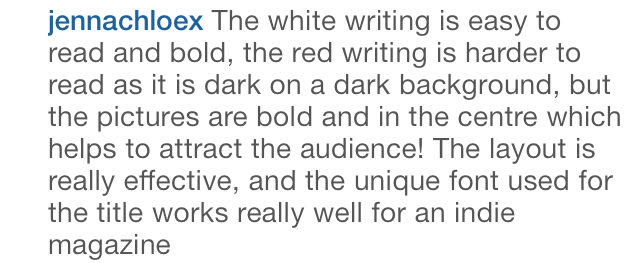
Here is what Jenna said about my Double Page Spread.
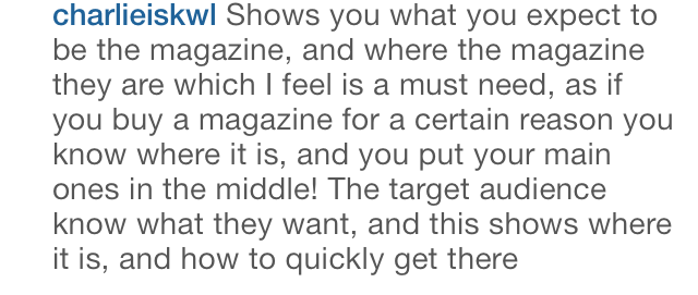
Here is what Charlie also said about my Double Page Spread.
From this feedback I have found that I have had a mix of positive and negative views. A positive is that my main image has worked well, clearly displaying my target audience of teenagers. A negative of my double page spread has been the writing colour and placing. My feedback says that the white writing is hard to read, from this I can learn that I should use a different colour. My feedback also says that my writing was hard to read with the background behind it. Taking both pieces of negative feedback, if I have the chance to remake my double page spread I would change the colour of my writing so it would be easier to read and the background wouldn't affect this.
Contents Page Feedback
After posting my Contents Page on Instagram I gained some feedback. Below is what was said.
Here is what Jenna said about my Contents Page.
Here is what Charlie also said about my Contents Page.
I have learnt a lot from this feedback on my Contents Page. I have found that most of the conventions on my page are correct and clear. The only thing that seems to be a problem is the colour of some of my writing in burgundy. If I had the chance to remake my magazine again I would change the colour of the writing so that it is easier to read.
Front Cover Feedback
After posting my Font Cover on Instagram I received some feedback very quickly. Below is the feedback I received.
Here is what my friend Jenna said about my Front Cover.
Here is what my friend Jenna said about my Front Cover.
Here is what my friend Charlie said about my Front Cover also.
From this feedback I have learnt which parts of my Front Cover I did well and which parts were not so good. I have found that the writing colours and sizes were probably not the best choice. I also found that the colour scheme was good and is obvious throughout.
Subscribe to:
Comments (Atom)


