Tuesday, 5 May 2015
New Evaluation
Question 1.) In what ways does your media product use, develop or challenge forms and conventions of real media products? (i.e. of music magazines)
Question 2.) How does your media product represent particular social groups?
Question 3.) What kind of media institution might distribute your media product and why?
Question 4.) Who would be the audience for your media product?
http://www.kizoa.com/Video-Maker/d20162975k8383712o1l1/question-4
Question 5.) How did you attract/address your audience?
Question 6.) What have you learnt about technologies from the process of constructing this product?
<iframe width="480" height="311" src="http://www.powtoon.com/embed/b5uu72rY9eg/" frameborder="0"></iframe>
Question 7.) Looking back at your preliminary task (the school magazine), what do you feel you have learnt in the progression from it to full product?
Question 2.) How does your media product represent particular social groups?
Question 3.) What kind of media institution might distribute your media product and why?
Question 4.) Who would be the audience for your media product?
http://www.kizoa.com/Video-Maker/d20162975k8383712o1l1/question-4
Question 5.) How did you attract/address your audience?
Question 6.) What have you learnt about technologies from the process of constructing this product?
Question 7.) Looking back at your preliminary task (the school magazine), what do you feel you have learnt in the progression from it to full product?
Sunday, 2 March 2014
Evaluation
Question 1.) In what ways does your media product use, develop or challenge forms and conventions of real media products? (i.e. of music magazines)
<iframe src="http://prezi.com/embed/73akpqmlfmjn/?bgcolor=ffffff&lock_to_path=0&autoplay=0&autohide_ctrls=0&features=undefined&disabled_features=undefined" width="550" height="400" frameBorder="0" webkitAllowFullScreen mozAllowFullscreen allowfullscreen></iframe>
Question 2.) How does your media product represent particular social groups ?
<iframe src="http://www.slideshare.net/slideshow/embed_code/31813938" width="476" height="400" frameborder="0" marginwidth="0" marginheight="0" scrolling="no"></iframe>
Question 3.) What kind of media institution might distribute your media product and why?
<iframe src="http://www.slideshare.net/slideshow/embed_code/31814715" width="476" height="400" frameborder="0" marginwidth="0" marginheight="0" scrolling="no"></iframe>
Question 4.) Who would be the audience for your media product?
http://youtu.be/ClR_Xd0tYzA
100%
Question 5.) How did you attract/address your audience?
<iframe src="http://prezi.com/embed/7euyiisusqd1/?bgcolor=ffffff&lock_to_path=0&autoplay=0&autohide_ctrls=0&features=undefined&disabled_features=undefined" width="550" height="400" frameBorder="0" webkitAllowFullScreen mozAllowFullscreen allowfullscreen></iframe>
Question 6.) What have you learnt about technologies from the process of constructing this product?
http://youtu.be/DzfTIZr4ass
Question 7.) Looking back at your preliminary task (the school magazine), what do you feel you have learnt in the progression from it to full product?
<iframe src="http://www.slideshare.net/slideshow/embed_code/31822468" width="476" height="400" frameborder="0" marginwidth="0" marginheight="0" scrolling="no"></iframe>
<iframe src="http://prezi.com/embed/73akpqmlfmjn/?bgcolor=ffffff&lock_to_path=0&autoplay=0&autohide_ctrls=0&features=undefined&disabled_features=undefined" width="550" height="400" frameBorder="0" webkitAllowFullScreen mozAllowFullscreen allowfullscreen></iframe>
Question 2.) How does your media product represent particular social groups ?
<iframe src="http://www.slideshare.net/slideshow/embed_code/31813938" width="476" height="400" frameborder="0" marginwidth="0" marginheight="0" scrolling="no"></iframe>
http://youtu.be/ClR_Xd0tYzA
<iframe src="http://www.slideshare.net/slideshow/embed_code/31822468" width="476" height="400" frameborder="0" marginwidth="0" marginheight="0" scrolling="no"></iframe>
Saturday, 1 March 2014
Double Page Spread Evaluation
This is my final double page spread for my indie music magazine. I used conventions of music magazines to create these pages. My colour scheme is still the same throughout this page using grey, white, black and burgundy. The main image for this double page spread is of the model I chose to be my artist. I chose this photo specifically because in other magazines I noticed that the model is on one page with the scenery spreading to the other page. Behind my model on the left hand page I put the logo for my artist that is also seen on the front cover. Beneath this is a quote from the text on the right hand side. I put this in a font which I found from 'dafont.com'. This font makes the quote stand out really well. I also decided to change the colour for the last word 'fans' and the size of the word too to emphasise it. In the very bottom left hand corner I put the information for the main image. I put here the models name, the date it was taken and the place it was taken. I did this because I have also seen this convention in may other magazines. On the right hand side page, I put the title for the article at the top, in bold so it was obviously the title. Underneath this is the subtitle, also in black but smaller to make it seen as important but not as important as the title. Lastly, three columns of writing which is the article. I made the text at the beginning white as the introduction, then after that the questions are in burgundy and the answers in white. All of this right hand page is a typical layout of a music magazine of which I have seen and took the idea and adapted it from. Finally, the last conventions I added are the same logo and date of which was on the contents page, I kept this on this page as in NME I saw this convention, they have this running through the whole magazine. One other thing which runs through the whole magazine is the page numbers in triangles. I used this too because I also felt this was a great touch to the magazine. I am very pleased with the outcome of my double page spread. I feel as though I have used as many conventions as I can and that it looks professional.
Contents Page Evaluation
This is my final contents page for my indie music magazine. I chose the colours grey, black, white and burgundy for this page. I did this because this is the colour scheme for my indie music magazine. I used lots of conventions on my contents page of which I have previously seen on other indie music magazine contents pages. First of all, I made sure the masthead was in the top left hand corner with the title 'Contents' underneath. I did this because it is a convention I saw in other music magazines. Another thing I did was make a band list, this is something I saw in NME magazine. I liked this idea and I thought it was add to my magazine and its indie style. On the left hand side of the page I have my contents information, this has two section in it, 'Features' and 'Regulars'. I did this because most magazines have their contents information split in two. In the bottom left hand corner is an contact information box. This box includes social networking sites which you can follow to keep up with the magazine. This is also a convention of which I found in other magazines. The middle section of my contents page is three pictures with a caption, these are the main pieces of contents. I decided to do this because NME do a similar thing and I thought it was very effective and eye catching. In the bottom right hand corner is a subscription which is very popular in all magazines lately. I added the logo and date to the bottom of the page because this is was used in NME, as well as the style of the page number. I liked all of these conventions because I feel that it adds to the indie theme. I am happy with how my final contents page has ended up. I feel that I used the correct conventions and that my contents page supports the idea of a indie music magazine.
Front Cover Evaluation
This is my final front cover page for my indie music magazine. I have chose the colours, grey white, black and burgundy for everything on this page because this is my colour scheme. I thought these colours were appropriate as I have seen these colours mostly used on other indie music magazines. The barcode, price and date, puffs, cover lines and masthead are all conventions of an indie music magazine and are the reason I used them. I decided on three cover lines, the posters, interview with Romy Stone and Vampire Weekend because I didn't want to overload the cover page, I wanted the main image to be the key on this page and too many would cover the picture up too much. I also decided on having one puff because I thought the winning tickets offer would look good in a puff and make it stand out more. In the end I decided on having a forth cover line at the bottom which was put in a different colour so it looked more important. I made the barcode vertical because I have also seen this as a reoccurring convention on indie music magazines, also I think by having it vertically you can see more of the page and picture and it is more out of the way. I decided to have my masthead very simple and keep this as the logo all the way through the magazine. The only thing different about this masthead compared to all of the logos throughout the magazine is that instead of the middle of the letters being white I blended them in with the background more making the inside a reddish pink. I put underneath my masthead another convention of the date and price. This was written in black and in a curly font to make it look professional but also so that it wasn't seen as a main thing on the magazine but so it was still noticeable. I am pleased with how my front cover has come out finally. I'm glad that I changed certain things and also I feel I did the best that I can. I also feel that I have used all of the right conventions of an indie music magazine.
Doube Page Spread Feedback
Once posting my Double Page Spread on Instagram I got some feedback from people on the site. Below is what they informed me.
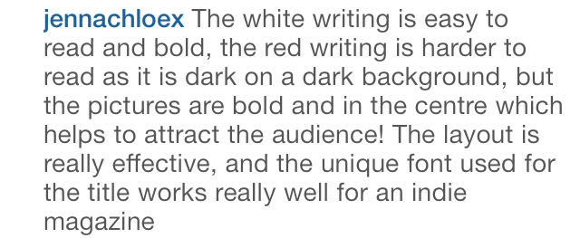
Here is what Jenna said about my Double Page Spread.
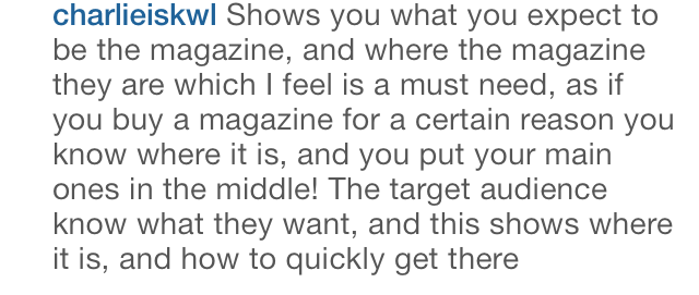
Here is what Charlie also said about my Double Page Spread.
From this feedback I have found that I have had a mix of positive and negative views. A positive is that my main image has worked well, clearly displaying my target audience of teenagers. A negative of my double page spread has been the writing colour and placing. My feedback says that the white writing is hard to read, from this I can learn that I should use a different colour. My feedback also says that my writing was hard to read with the background behind it. Taking both pieces of negative feedback, if I have the chance to remake my double page spread I would change the colour of my writing so it would be easier to read and the background wouldn't affect this.
Here is what Jenna said about my Double Page Spread.
Here is what Charlie also said about my Double Page Spread.
From this feedback I have found that I have had a mix of positive and negative views. A positive is that my main image has worked well, clearly displaying my target audience of teenagers. A negative of my double page spread has been the writing colour and placing. My feedback says that the white writing is hard to read, from this I can learn that I should use a different colour. My feedback also says that my writing was hard to read with the background behind it. Taking both pieces of negative feedback, if I have the chance to remake my double page spread I would change the colour of my writing so it would be easier to read and the background wouldn't affect this.
Contents Page Feedback
After posting my Contents Page on Instagram I gained some feedback. Below is what was said.
Here is what Jenna said about my Contents Page.
Here is what Charlie also said about my Contents Page.
I have learnt a lot from this feedback on my Contents Page. I have found that most of the conventions on my page are correct and clear. The only thing that seems to be a problem is the colour of some of my writing in burgundy. If I had the chance to remake my magazine again I would change the colour of the writing so that it is easier to read.
Front Cover Feedback
After posting my Font Cover on Instagram I received some feedback very quickly. Below is the feedback I received.
Here is what my friend Jenna said about my Front Cover.
Here is what my friend Charlie said about my Front Cover also.
From this feedback I have learnt which parts of my Front Cover I did well and which parts were not so good. I have found that the writing colours and sizes were probably not the best choice. I also found that the colour scheme was good and is obvious throughout.
Friday, 28 February 2014
Feedback
I have posted my final Front Cover, Contents Page and Double Page Spread on the social networking site Instagram to get some feedback. I posted the pictures separately and asked for some feedback on them. I have done this because the people on my Instagram are the kinds of people who would read this type of magazine, therefore I thought feedback from them would be the best. They are of the right age and this feedback would be very beneficial. I will now wait for some feedback from people on Instagram.
Font Cover on Instagram
Contents Page on Instagram
Double Page Spread on Instagram
Text Choices
For my magazine I have decided to use the font 'Lucida Sans' for most or all of my general text for my magazine pages. I chose this font because it is clear and not completely simple it has some nice shape to the letters. This font is also the kind of font which may be used in an indie music magazine.
I then chose a font from 'dafont.com' for my masthead for the logo of my magazine which I also used throughout my magazine. This font was called 'Moiser Techno'. I chose this as the logo for my magazine because I felt it was very simple, yet bold and it stands out a lot. When this was chosen as my final font, I doubled it, putting a white version slightly smaller on top to make it a white font with a black out line.
Another font I used was 'Script MT Bold' for the date and price underneath the logo for my magazine of the front cover. I chose this font because it looked professional and it was clear.
One other font I used called 'Progress' I used for the writing of the artist on the front cover of my magazine. I chose this font because it was very big and bold. It stands out as being strong and independent therefore I thought it was only suitable. When editing this font, I made it the burgundy colour which I have been using throughout my magazine.
I then chose a font from 'dafont.com' for my masthead for the logo of my magazine which I also used throughout my magazine. This font was called 'Moiser Techno'. I chose this as the logo for my magazine because I felt it was very simple, yet bold and it stands out a lot. When this was chosen as my final font, I doubled it, putting a white version slightly smaller on top to make it a white font with a black out line.
Another font I used was 'Script MT Bold' for the date and price underneath the logo for my magazine of the front cover. I chose this font because it looked professional and it was clear.
One other font I used called 'Progress' I used for the writing of the artist on the front cover of my magazine. I chose this font because it was very big and bold. It stands out as being strong and independent therefore I thought it was only suitable. When editing this font, I made it the burgundy colour which I have been using throughout my magazine.
Thursday, 27 February 2014
Article for Double Page Spread
MY RISE TO FAME
Romy Stone reveals all top secret information about how she rose to fame in just under six months on YouTube
Hey Romy, nice to have you in the building today! First question to be fired is, how is the new album coming on?
Hi Emily, it's a pleasure to be here! Well, it's nearly complete really just a little more editing to be done and it will be ready to release! It's really exciting to have my first album nearly done!
That's really great! We can't wait to hear it! What is the album based around? Does it have any hidden messages or stories?
I can't wait to hear it all finished either! Messages and stories? Yeah there are a few, some of the songs basically describe how I was feeling at certain times like ups and downs in my life, stories in there of past experiences which have impacted my life a lot. It's an album letting my fans know my inner most thoughts and feelings over these past few months, although there are a few songs of which I wrote a while ago, a few of my personal favourites.
Well, I'll be sure to listen to it! So, what has this record deal done to your life? What changes have been made? Any positives or negatives?
Thanks, it means a lot! Well the record deal has changed an awful lot in my life! I get recognised in lots of different places, asked for autographs, photos, being asked to go on talk shows and magazine interviews! It hasn't really got any negatives! I'm just busy all the time now, and I really love it! It has been the best opportunity for me! I wouldn't be here without my fans! Thanks to them I got recognised and it has hopefully changed my life forever!
We're all so happy for you here at BMA! How did you feel when Universal Music Group contacted you because of your YouTube videos?
Thank you! First of all I was completely utterly shocked! I couldn't believe they were interested in my! It was a dream come true and if it wasn't for my fans, I don't think they would have even noticed me! The amount of views and subscriptions I got on YouTube was overwhelming and I felt so incredibly lucky! The moment they offered me a contract I burst into tears but I could not ever turn the offer down, it was one hundered percent a yes!
We're thrilled for you! A new genuine star is what this industry needs! And we can garruntee we will be playing your album when it comes out! It's been an honour having you here today! Thank you!
Thank you! It's been a pleasure for me too! Hope to see you soon!
Wednesday, 26 February 2014
Gig Photos
On my contents page I decided I wanted to put pictures of other bands who would feature in my magazine. But because I had tot take the pictures myself otherwise it wouldn't count I decided I would use the pictures of which I took when I was at a Jake Bugg gig on Friday 21st February 2014 and Two Door Cinema gig on Friday 13th December 2013. These pictures were taken from the view I had whilst at the gigs. I thought this would be a good touch to my magazine because the pictures were really taken by me and it gave me extra to put on my contents page, other images making it more interesting. Below are the pictures I chose from all of the pictures from the gigs.
I chose this picture from the Jake Bugg gig because its very clear and you can tell its Jake Bugg because of the logo in the back which is also very clear. The lighting in this image is good and the quality of the picture is good considering it was taken from an iPhone.
I chose this picture from the Two Door Cinema Club gig because it is also clear for the view I had at the O2. This photo shows the scale of the gig really well and how many people were there. The light in this image is also good, you can see the lights from the stage really well.
I chose this picture from the Jake Bugg gig because its very clear and you can tell its Jake Bugg because of the logo in the back which is also very clear. The lighting in this image is good and the quality of the picture is good considering it was taken from an iPhone.
I chose this picture from the Two Door Cinema Club gig because it is also clear for the view I had at the O2. This photo shows the scale of the gig really well and how many people were there. The light in this image is also good, you can see the lights from the stage really well.
Tuesday, 25 February 2014
Today's Progress of Front Cover
Today I edited my front cover because I decided with some feedback that I didn't like the all black and white cover. I decided that I wanted to add some colour onto my front cover. First of all I made a decision on what colour to add to my page. I decided on a burgundy red colour because i feel it fits well with black and white. Next, I changed my font for the word 'ROMY' because the previous font was difficult to work with. I made the font large and made that the red colour. I then made the bar along the bottom the same colour so that they it stood out in this colour but also because having one thing in red would look silly. After, I tinted the back ground with the same red colour so that everything looked as though it fitted together and the red didn't stick out too much. Lastly, I made all my boxes on the page which have writing in them more opaque. This made the boxes look a lighter grey so therefore I have a red, white, black and grey colour scheme. Because of these colours my magazine is staying with these colours on my other pages.
Progress of Today
Today I have worked on my contents page a bit. First of all I added in three pictures in the middle row of my contents page. These pictures are to do with what is inside the magazine, Romy Stone's interview, Jake Bugg tour review and Two Door Cinema Club tour highlights. I made these pictures quite big and dominant on the page so that they were obviously important articles. For the short piece of writing underneath eh pictures i made the information white, and the page number red so that they contrasted and the information was obvious. Next I finished off the contact box at the bottom left hand side of the page. by making sure of the links were correct and also making sure i had a logo for each site.
After, I started on my Band List for my contents page. This convention i found in NME magazine. It is simply a list of bands with a page number where you will find information of that specific band. I decided to use this convention because I am following the main conventions of NME magazine. To create this Band List, I made a tile for the list and made it very big and bold. I then separately made a list of all of the bands of which i was going to put on the final list. I then put them all in alphabetical order so that the list would be easier to read and would make sense. Next I gave eacher band a page number which the reader would then know what page to find a specific band on.
Lastly I created the contents list on the left hand side collumn. I made a heading for the contents which I made sure was the same size as the band list heading. I then in the bigger box made subheadings of 'Features' and 'Regulars'. These are also conventions of NME magazine which i found interesting and I wanted to use them. I then added in the features content and made the information white and the page number red like i did with the band list to make it all blend in together. Next, I added in the regulars information using the same colour technique as the features information.
Tuesday, 18 February 2014
Today's Progress of Contents Page
Today I have been working on my contents page. I started out with just a blank page today and have been slowly building it up relating back to my hand drawn design I made a while back. Firstly I chose a colour of the background of the page, I chose a medium grey colour because I felt it was neutral. I do like this colour but it may change throughout the making of my contents page. I then added some boxes at the bottom of the page as I thought it would be easier to start building my page from bottom to top as the bottom of the page is less complicated. I made the left hand box slightly longer than half way across the page and about an inch high. I made the box next to that the size of the rest of the space and the same height with just a tiny gap between both boxes. The boxes are a slightly darker grey colour in contrast to the background, and yet again this colour may change as I think grey is very bland but it could be effective and I will consider the colours later on. I next copied and pasted from the internet a the Facebook logo, the Twitter logo and the Instagram logo. I then made them a lot smaller and put the inside of the bigger box. From this idea I made accounts on Email, Facebook, Twitter and Instagram for BMA magazine so that my links are true and give a little extra to my magazine. After creating these accounts I pasted the links for each one next to the correct icon. I used the same font as I have thoughout my magazine so far and I put the writing in white so it contrasted against the box colour. For the smaller box, using the same font and colour I wrote about subscribing to BMA magazine as I found this in NME magazine when analysing it. I wrote about how much it would cost for a year and when the special deal ends. I will write more in this box another day because I think what I have written is very simple and not to eye catching. Below is a print screen of my work as I left it today in InDesign for my contents page.
Social Networking
Whilst in the production of my magazine, I came across social networking. It seemed to be very popular on the magazines of which I previously looked at and seeing as more recently promotion is done though the social networking websites. Because of this I decided to take my magazine a step further and create the pages of which I will be putting in my magazine so that you can really access these pages.
The first thing I had to do when creating all of these different sites and pages for my magazine I had to create an email address especially for my magazine so that wherever I sign up I can always refer back to this email and all of my social networking accounts and information can be accessed here. I will also be placing my email on my music magazine with all of my other social networking information because I feel it is a close way of connecting with the target audience for any problems, ideas or queries. Below shows my email account for BMA magazine.
Next I made an account on Instagram for BMA magazine because this is the most up to date picture sharing social networking site of the present day. I think this is a good promotional site because not only can you have followers like the other sites you can visually show things which may appear in the next issue or ask for opinions on designs. Below shows my Instagram page for BMA magazine.
The first thing I had to do when creating all of these different sites and pages for my magazine I had to create an email address especially for my magazine so that wherever I sign up I can always refer back to this email and all of my social networking accounts and information can be accessed here. I will also be placing my email on my music magazine with all of my other social networking information because I feel it is a close way of connecting with the target audience for any problems, ideas or queries. Below shows my email account for BMA magazine.
The next thing I did was set up a Facebook page. I did this by going onto my own page and creating a page from there. I had to add in a little information on the page and also a picture of which I chose the BMA logo as I thought that would be the most sensible. From this Facebook page I can invite or suggest to people who use Facebook to look at my page and even read my magazine or give me feedback for my magazine. Below shows my Facebook page for BMA magazine.
After this I decided to also make a Twitter account. I made this account because lately twitter has become more popular in the social networking world than Facebook at the moment and more and more people are joining it every day. I personally use Twitter for finding out about bands therefore I only thought it appropriate to put BMA on Twitter too. Below shows my Twitter page for BMA magazine.
Next I made an account on Instagram for BMA magazine because this is the most up to date picture sharing social networking site of the present day. I think this is a good promotional site because not only can you have followers like the other sites you can visually show things which may appear in the next issue or ask for opinions on designs. Below shows my Instagram page for BMA magazine.
Friday, 14 February 2014
Today's Progress of Double Page Spread
Today I have been working on my double page spread in InDesign. I have added the quote on the main image from what the text will say. I used the same text as I have used basically everywhere else in my magazine. I placed this text in the bottom right hand corner of the left had side page so that the image is still seen yet the writing is also seen. In the bottom left hand corner of the left hand page i decided to add a little information about the picture so that the reader knows where, when and who the picture is of and taken by. I also put this in the same font and the rest of my magazine. At the bottom of both pages in the margine I decided to put my magazine name and the date of my magazine to remind the reader what magazine they're reading. I used the actual lodo of my magazine, I just resized it and I used the same date which I also used on the front cover. On the right hand side page I added in the title for my article also in the same font. I gave it a shadow to make it stand out more compared to the other large writing on the page. I next added the subtitle for my article which is only a sentence and I also put that in bold but a lot smaller writing. Al the writing on my page is in black because I feel it looks best and fits in well with theme and colours. Lastly I added two tirangles at the sides of my pages in the margines which have the page numbers in white. I like this idead I had because it looks indie for my magazine and I think it looks good. Below is my progress of today.
Thursday, 13 February 2014
Today
Today I have decided to work on my double page spread as I feel this is a priority right now. I have placed my picture into InDesign on a double page spread layout, I now will plan and start to write the text for my double page spread so that it will be easy to place it in after. I plan to have it in three columns which I can easily use by using a setting on InDesign. I will also be adding some bolder larger texts within the article so that they look more important, these will be things such as quotes from my artist. I have also been developing a title for the article which will be in large writing about the article.
As I have been developing my double page spread I have noticed some conventions of which I put in my plan of my double page spread of which I have come across in the production and feel I will have to change. One thing I have changed is the background picture. This originally was going to be on the left hand page, but because of the composition of the final picture of which I chose for the double page spread the model is on the right hand side and the wall stretches over the second page on the left hand side. Therefore I will put the main image onto the right hand side and the article on the left hand side.
Lastly, today I am attempting to start the article and am also deciding what words, phases and quotes I am going to have dotted around on my double page spread.
As I have been developing my double page spread I have noticed some conventions of which I put in my plan of my double page spread of which I have come across in the production and feel I will have to change. One thing I have changed is the background picture. This originally was going to be on the left hand page, but because of the composition of the final picture of which I chose for the double page spread the model is on the right hand side and the wall stretches over the second page on the left hand side. Therefore I will put the main image onto the right hand side and the article on the left hand side.
Lastly, today I am attempting to start the article and am also deciding what words, phases and quotes I am going to have dotted around on my double page spread.
Subscribe to:
Posts (Atom)